50 Web Design Statistics That Will Blow Your Mind
Key Takeaways
- 65% of consumers prefer content and websites that display well on the device they're using.
- 64% of consumers value content that holds their attention.
- 54% of consumers appreciate content that appeals to their design sensibilities.
Five things stuck out to me while reading an Adobe study with 12,169 consumers from 6 countries. Consumers enjoy companies that ensure their content and website:
- Displays well on the device they’re using (according to 65% of consumers)
- Holds their attention (according to 64% of consumers)
- Appeals to their design sensibilities (according to 54% of consumers)
- Personalizes their interests (according to 49% of consumers)
- Works across multiple devices (according to 45% of consumers).
Also, 59% of consumers would choose a beautifully designed website over “simple and plain” designs. To give you a better idea, a ‘simple and plain’ design could be a website with a generic template and minimal visual appeal.
My takeaway is that the visual feel and ease of navigating your website are as important as your content or the solution your business offers.
Having this in mind, we compiled a list of mind-blowing statistics to help you design or redesign your website with the consumer in mind.
Web Design Statistics to Create User-Centric Designs
User experience is essential while building your website. It gives soul to your content and provides a visual experience for your ideal customers and visitors. Here are some statistics to keep in mind during your website building or rebranding process:
1. 43% of small business owners plan to improve website performance and page speed. This is to reduce delay, increase conversion, and provide a better overall user experience. This statistic could be particularly relevant if you’re a small business owner looking to enhance your online presence.
2. 49.6% of marketers use views, reach, and impressions as their primary benchmark. They focus less on engagement (25.5%) and conversions or sales (24.9%).
This is because views and impressions depend largely on how great a website design is, and they are a metric that determines growth in brand awareness. After all, most of your target audience isn’t ready to buy when they discover your brand; the goal of content marketing is to be top of their minds when they’re in the buying stage.
3. 84.6% of designers agree that crowded web design is the most common mistake designers make.
Using too much text, images, and ads confuses readers and is a huge turn-off. The best rule of thumb is to keep them as minimal as possible so they can understand your business (or find what they need to know).
4. 60% of consumers will abandon their cart if they’re buying on a website with poor user experience. To prevent this, ensure your website is user-friendly, with clear navigation and a streamlined checkout process.
5. Only 27% of consumers think chatbots are important on e-commerce websites. This means you can use them to answer questions quickly and engage visitors more, but some consumers don’t think it’s an essential feature.
6. 59% of consumers will choose beautiful designs over a simple and plain website. This is because they believe websites should hold their attention with their design and high-quality content, not simple web views.
7. 60% of shoppers will check product reviews online when shopping in a physical store. Adding a space for reviews on your website can influence walk-in customers to buy your product.
8. According to an eye-tracking study by Eyequant, the top-left corner of your page gets user attention first. A report by Yahoo verifies this, showing that your value proposition should be moved to this corner of the page to improve the success of any content campaigns.
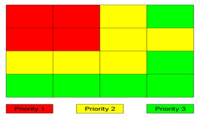
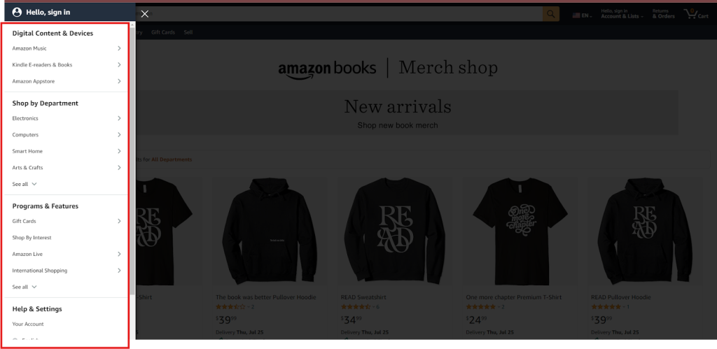
9. Web users spend 80% of their time looking at the left half of a page (and 20% of the right half of the page. This is why mainstream websites like e-commerce sites, news sites, company pages, and government websites have a split full-screen page down by the middle to increase their focus on what matters. Here’s an example from Amazon:
10. A staggering 42% of people say they’ll leave a website because of poor functionality. This is a significant loss of potential conversions that could be avoided with better web design.
The takeaway?
Focus on clean website layout, smart navigation systems and fast load times to keep visitors engaged and ready to complete their user journey. We provide web design services for e-commerce, service-based and B2B companies, and we know how to increase engagement with user-centric designs.
11. 53.8% of small business owners believe hiring a web designer will create a customized website. Only 23.1% said they used a website builder for their e-commerce store.
Choosing professional web design companies is the best way to get a fully customized website that your visitors (and prospects) will love.
12. 38.5% of global designers believe that having a no-call-to-action button is the second most common mistake many designers make. This means visitors may leave a website without taking any desired action (which means a loss of potential conversions).
To avoid this, use CTA buttons to nudge your visitors to take a desired action based on the content of your web page.
13. 73% of small business owners invest in website design to stand out from competitors using templates for web design. This means a custom-designed and optimized website is a better way to attract user attention than using templates provided by website builders.
14. 88.5% of people believe slow loading time is a valid reason to leave a website.
Invest in the technical part of your website to improve engagement and conversion rates, such as optimizing images, increasing page speed and mobile responsiveness, and fixing broken links.
15. Your website conversion rate reduces by an average of 4.42% for every additional second in load time between 0 and 5 seconds. This means the slower your page speed, the higher the chances you’re losing prospects.
16. 52% of users may not engage with a website that isn’t responsive on mobile devices. This means you should optimize your website for mobile as much as desktop to improve user engagement on both devices.
17. The average user spends 4 hours 32 minutes on their phones daily, and more than 61% of all website traffic comes from mobile devices. This means you can increase user conversion by primarily optimizing for mobile devices.
18. 72% of shoppers research products online before purchasing them in physical stores.
19. 92% of consumers feel hesitant to buy a product without customer reviews. This means you should encourage existing customers to leave reviews on your website.
An easy way to do this is to create a section on your website where visitors can read reviews before purchasing. This will also add social proof to your content and product pages. You can point consumers (potential ones) to review sites like Yelp and Trust Pilot.
20. Web design remote freelancers with experience building custom WordPress sites get paid between $3,000 and $15,000. We wrote more about web design pricing and the factors that can impact the cost of a new website here.
21. In the US, do-it-yourself website builder platforms are valued at $24 billion and are growing at an annual rate of 4.9%. Small business owners who would instead build their online stores can easily do that with guides from these platforms.
22. Since people spend more time on mobile devices, 67% say they’re more likely to buy from websites with mobile-friendly designs.
23. As of June 2024, 68.49% of traffic comes from mobile devices, and only 29.86% comes from desktop devices.
24. More users prefer simplified user interfaces because it has improved usability, minimize distractions and visual clutter, and are accessible on different devices to improve user experience.
This is why searches for Flutter, an app development software, spiked in 2018 and have increased by 438% in five years.
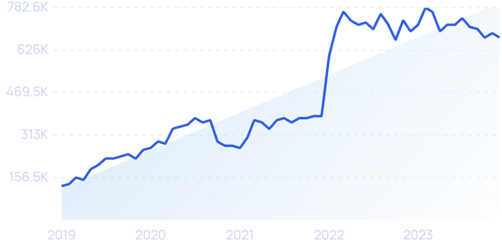
25. Designers are doubling down on motion design to increase user engagement, comprehension, and interactivity with the website (or app). The goal is to provide micro-interactions and an animated scrolling experience for visitors.
26. As searches for deep fakes increased by 279% over five years, studies show that users are looking for signs that an e-commerce website is authentic. This means designers need to improve user confidence through user interface design choices.
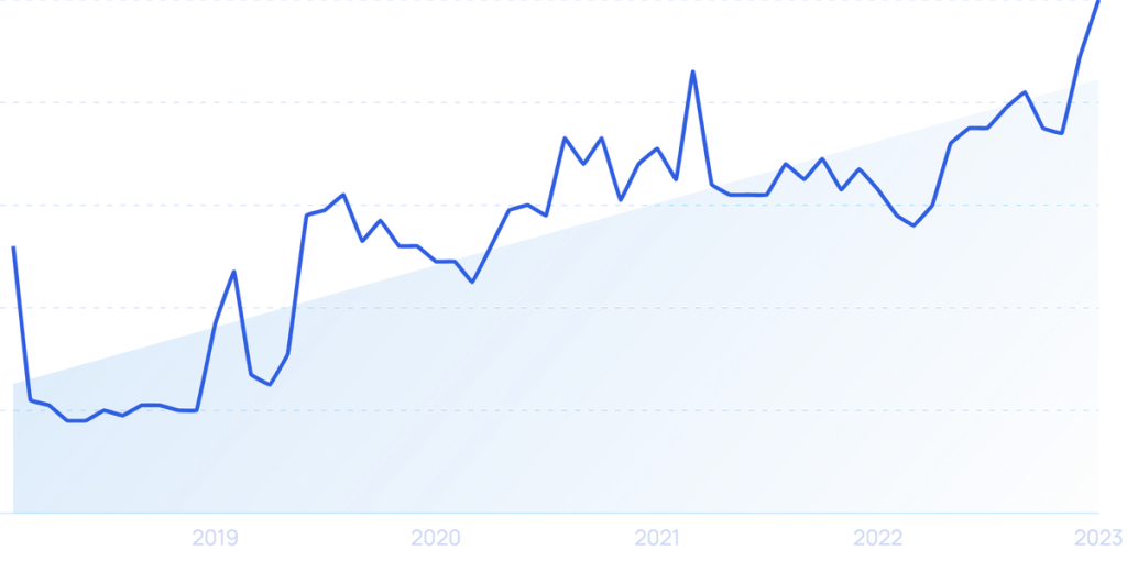
27. Over 96% of the world’s top 1 million websites are not accessible, according to Web Accessibility in Mind. Because of this, designers are focusing on inclusive designs, according to Exploding Topic.
28. 51% of enterprises say there is a 25% increase in budget for user experience because it is a core part of user retention strategies.
29. 80% of people will pay more for a better user experience while browsing or using a mobile app. This means that making little improvements in user experience can boost customer satisfaction and willingness to spend on your product.
The takeaway? Pull users in with high-quality visuals, and maintain a consistent choice of colors and fonts to reinforce your brand identity.
30. 88% of users will stay longer on websites with videos. This is because videos are one of the most consumed content formats.
Users have short attention spans but can consume content faster by watching videos. Not all your visitors would want to read your content; integrate short videos to increase user engagement and conversion.
31. 23% of people with a positive user experience share it with ten or more people. This means that to improve your ROI through website design, make the user experience as encouraging as possible.
Satisfied users will tell their friends and co-workers about their browsing experience. For example, HubSpot, a CRM tool, recorded a 300% increase in conversion from word-of-mouth referrals after redesigning its UX by incorporating feedback and testing new conversion methods.
32. 88% of users who have a bad browsing experience on your website will not return. This means you only have one opportunity to provide relevant content (and make their experience memorable) to increase the possibility of staying top-of-mind.
33. Because of poor UX and intrusive ads, 24% of Android apps are uninstalled within 24 hours of download. 49% more are uninstalled within a month.
34. To improve user experience, a study shows that 85% of all website-related issues can be solved by testing with 5 users. Zippia says the first three test users will discover 65% of all website-related issues.
35. More than 38% of internet users will stop engaging with unattractive website content or layout. This means you should optimize your website layout (and content) to make it readable and engaging.
If not, your engagement rate may stay the same over time, affecting your conversion rate.
36. 70% of online businesses fail because of bad usability. This means that the website’s elements (or features) complicate the user’s ability to navigate and interact with it.
The takeaway?
You need to invest in providing a good user experience to stay competitive and improve customer loyalty.
37. Businesses lose over $6.8 billion annually due to slow page speed.
38. 50% of consumers agree that a company’s website is vital to its brand success. This means that having a great website is an easy way to turn visitors into sales-qualified leads and turn those leads into loyal customers.
39. 89% of users have switched to a competitor’s website after a poor user experience. With less than 5 seconds for users to choose to stay or leave your website, providing a good user experience is an easier way to keep your competitors at bay.
40. 40% of consumers value photos/images, 39% value color designs, and 21% prefer videos as top visual elements in website designs.
41. Regarding color preferences, 46% of consumers prefer blue, while 30% prefer green.
42. According to 26% of consumers, yellow is the worst color for designing a website.
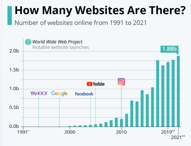
43. According to Statista, there were 1.88 billion websites between 1991 and 2021. According to Curate Labs, only 201,898,446 are active.
44. 22% of visitors visiting a website for the first time look out for eye-catching colors, but 21% will leave if the site colors are too bold or outlandish. This means you should consider using primary color schemes, which 26% of users prefer.
These are the colors red, blue, and yellow. A mix of these helps you grab user attention because they’re prominent and will immediately catch the user’s eye. They evoke specific emotions (depending on your niche). For example, red elicits energy and excitement, while green portrays calmness and health. Your choice of color also explains your brand identity.
45. Only 8% of first-time website visitors notice white space, even when it’s an important part of web design. This doesn’t mean you should erase white spaces. White spaces help readers break from colors and texts to relax their eyes and refocus their attention.
46. Red buy buttons can boost sales and conversions on e-commerce websites by as much as 34%. This is one reason why the color red is important in web design.
47. In terms of market importance and growth, the web design industry generated $42.2 billion in revenue in 2023. This shows the growing importance of web design in online businesses.
48. Statista also recorded about 200,000 web designers and developers in the United States in 2022 and estimates this number will reach 229,000 in 2032.
49. 30% percent of small business owners plan to embed more video content on their websites to improve performance.
50. The most visited websites in the world are Google (130,100,000,000) and YouTube (73,400,000,000).
Note: If you’re looking to build or rebrand your website, here are 15 Best WordPress Design Agencies in 2024 to consider.
Conclusion
Having a well-designed website is an asset and a necessity.
It’s necessary because it’s one of the organic ways your ideal customers can connect with you. It’s an asset because it’s your chance to create a fantastic user experience so they keep coming back to read or buy from you.
With these web design statistics, you now know some things that increase churn and how to avoid that from a design perspective. If you need to hire a web design service for your business, contact us and let us be a part of your conversations.
Referenced Sources:
