Best Practices for UX & SEO: 7 Tips for Improved Results
Google’s John Mueller shared some insights on this via Search Central Podcast. He said:
“What matters for Google is not that a website is attempting to give users a good page experience but rather, if it’s actually giving users a good page experience.”
A website with a “good” user experience caters to users’ needs in the exact way they “want” or “perceive” it to be. It shows a thorough understanding of their needs, behaviors, and pain points and is designed to provide a usable and functional digital experience.
SEO, however, focuses on optimizing (or improving) your website to cater to the user’s search intent. This means giving users a “quality” search experience that allows them to find solutions to their problems quickly.
Many marketers (and developers) believe that UX should always precede SEO. But what happens when we bring both on board? Will they conflict with or complement each other?
In this article, I’ll share seven (7) actionable strategies for combining SEO and UX. Before we dive into that, let’s cover the basics:
The Role of UX in SEO
Customer search patterns are changing thanks to the integration of AI and the need for instant results (zero-click searches and featured snippets). In turn, Google and other search engines are updating their algorithms to meet user needs, and their primary focus remains satisfying user search intent.
This post from Google Search Central validates my claim:
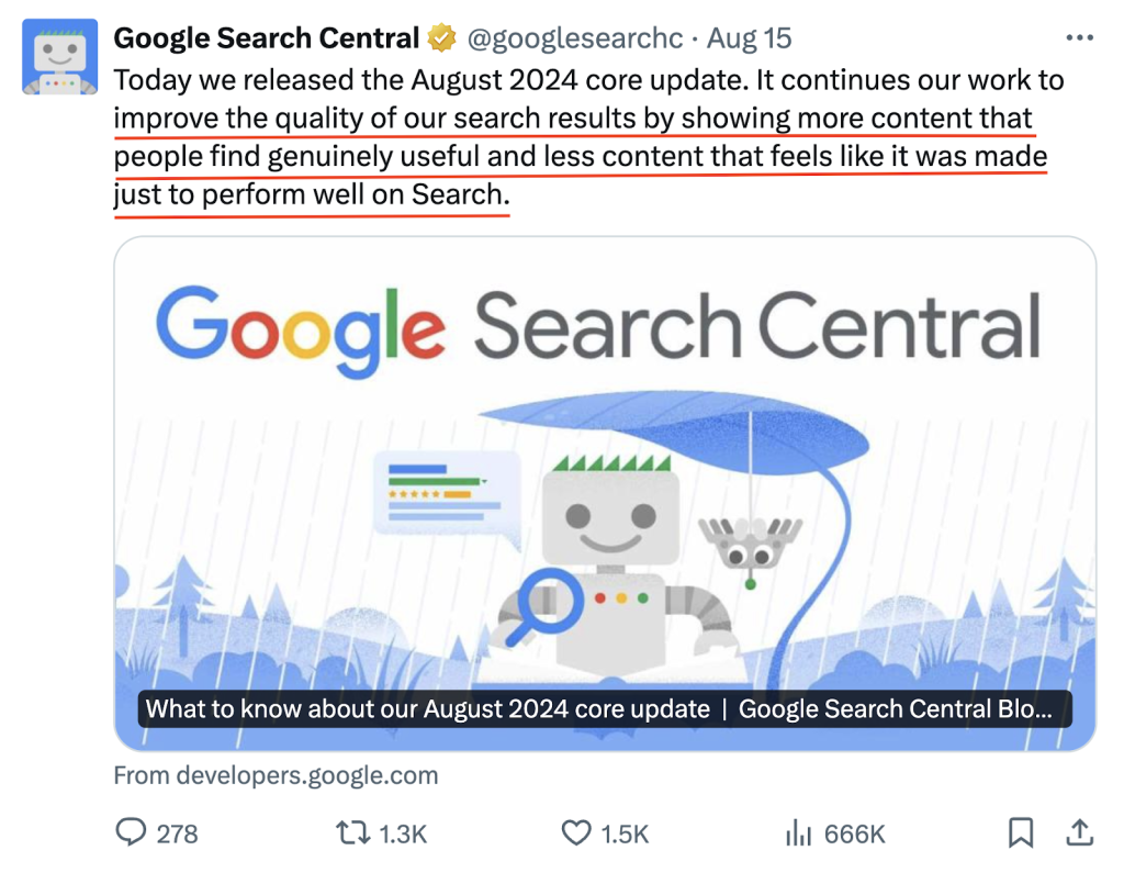
More details here:

Prioritizing UX in SEO sends satisfactory signals to Google that you’re optimizing for users instead of solely search engines. For context, when users find your website functional and enjoyable, they’re more likely to complete their desired action on your site. This leads to:
- Higher engagement,
- The longer time spent on a page,
- Low bounce rates,
- High click-through rates
…all these are Google’s way of ascertaining that users find your website helpful and relevant to their search queries. Now, how does the medley of UX and SEO help you achieve these results?
How to Combine UX and SEO to Improve Your Website Performance
Here are seven (7) tips to combine UX and SEO:
1. Don’t assume. Re-evaluate your web design:
Your web design isn’t all about aesthetics. It’s more than that.
When users land on your website, they expect an easy-to-navigate and enjoyable experience. If you fail to deliver this (let the experience meet their expectations), they will get frustrated and leave your site. And if this happens consistently, it sends warning signals to Google that your website isn’t optimized for users, leading to loss of ranking and traffic to competitors. To avoid this, evaluate your web design periodically for functionality and aesthetics, too.
We’ve experienced this first-hand at HigherVisibility. One of our clients, Restoration Roofing, has been in the roofing industry for over 15 years, but its online presence says otherwise. We took a bird’s-eye view of its website to find the exact issues affecting its performance and strategize on how we can build their presence.
The first thing we did was to redesign the website to give it a more polished, professional feel. We also fixed their backend with technical SEO in mind to ensure the pages load fast, is optimized for mobile, and the design isn’t either too complex or simple. We tried to redo the website to make it usable for users and search engines.
If you’re yet to build your website, I totally recommend this!
Next, we conducted a competitor research analysis to find opportunities they could use to dominate their market based on the gaps in their competitors’ strategies. We then implemented a couple of conversion optimization strategies to achieve:
- A 162% increase in organic traffic YoY
- A 400% increase in organic leads YoY
- A 164.89% increase in organic visibility YoY
This wouldn’t have been possible if we missed the first step—designing the website for users and search engines. Read the entire case study here, or have an expert from our team examine your website design. No worries—it’s free.
You may not be thinking of a redesign right now. But take a look at your website. Is it functional? Does it show a clear map to help customers find what they want?
Here are some things to do:
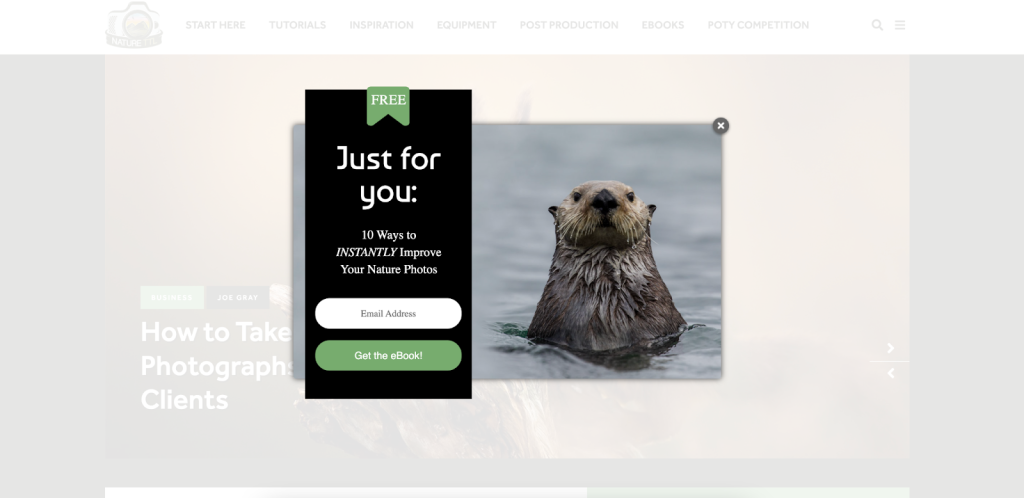
- Load your website on your browser. Check for intrusive pop-ups and ads that may affect user experience on your page. If you have personalized pop-ups (for example, a form to collect user emails for newsletters), provide an easy way for users to cancel. See this example:
- Use heat mapping and session recording tools like Hotjar to see first-hand how users interact with your site and find conversion blockers that affect your conversion rate. You can read how to do this here.
- Use Google Analytics to identify pages performing poorly in searches and re-optimize using the right keywords. We have a guide that shows you how to find the right keywords. Go through it here.
- Use a large and legible font size that’s easy on the eyes. Ensure there’s enough white space and contrast for a good reading experience.
- Use clear calls to action. Visitors should be clear about the next action to take. See this example from us at HigherVisibility. We’re prompting users to do something specific that satisfies their search intent:

2. Ensure your website loads fast:
How long do you stay on a website that takes < 10s to load? If you’re like 40% of online users, you likely left the site before it fully loaded without taking any action.
As a business owner, having a slow-loading website will cost you traffic, rankings and most importantly, conversions.
Page speed is (very) important to Google and is listed among the core ranking factors. Also, they expect your site to load within 2.5s or less. If your site isn’t within this threshold, you need to step up.
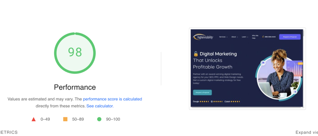
Google has a free tool for checking page speed – Page Speed Insights. After pasting your URL in the box, the results show a performance score for mobile and desktop devices. It looks like this:
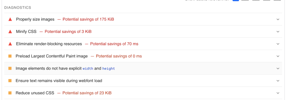
When you scroll down the page, you’ll see what’s affecting your page speed and recommendations for improvement:
The best part is that this tool also gives you insights into your SEO, accessibility and security performance – all of which affect user page experience:

I recommend running these checks for all your web pages, especially the high-value ones. This will give you an idea of your page(s) performance from a user’s point of view and the exact issues affecting your user experience.
What if you have more than ten web pages?
Instead of running checks for one page at a time, use SEO tools like Ahrefs or SEMrush to get a comprehensive audit for all your web pages. Ahrefs has a “slow page” feature that lets you see all the affected pages on your website in one place. It looks like this:

However, here are some page speed best practices you shouldn’t ignore:
- Remove all third-party scripts
- Use a good web hosting provider
- Minify CSS and Javascript
- Avoid adding banners or other content above the fold
- Compress images and use web-friendly image formats
We have a more detailed guide on how to improve your web speed. Check it out here.
3. Improve your website architecture and navigation:
When people land on your page, do they know where they are?
Your website architecture should be designed in a simple way customers can easily navigate. It should provide a clear, coherent, intuitive structure that guides them to the information they need without fretting.
The same applies to search engines. Your website should follow a logical and well-organized hierarchy to help search engine bots easily discern your page content and the connection between the web pages.
Google’s Lizzi Sassman gave the best method to achieve this:
“Think about the user journey. How are they coming to your page and from what experience? Search could be one path. Do they land in the middle of the document? They should know where they are in the context of what the page is about and the context of your site. So if they’re searching for something specific, they should be able to see in the site navigation all other related documents.”
A simple web-view like this is awesome:

To learn about your website architecture, start by running a manual check on your website. Is it clear? Does each page link to other related pages? Would a new user navigate your site without confusion?
You can take someone else’s opinion; preferably someone that’s not a part of your business/company. They have a fresh look and can point out all the areas you should improve. Here are some basic things you should do:
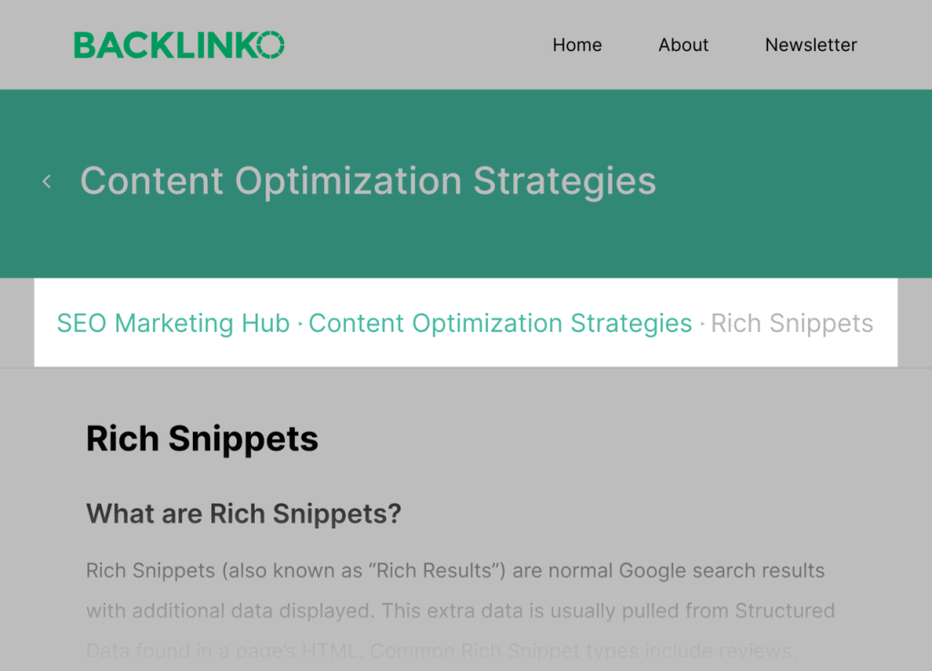
- Implement breadcrumb navigation on each page. Breadcrumbs provide a clear path from the homepage to the user’s current page, and it helps them to know where they are on your website. It looks like this:
- Use clear, descriptive page titles and URLs to help users and search engines understand the page’s context. Look at this example. It’s descriptive and gives users a clear idea of what’s in it for them:

The URL (it has the keywords “improve website visibility”:

- Internal links are powerful. Use them to link related pages or guide users to other helpful resources. For search engines, it helps them to understand the relationship between your web pages. This is even more important if you have hundreds and thousands of web pages.
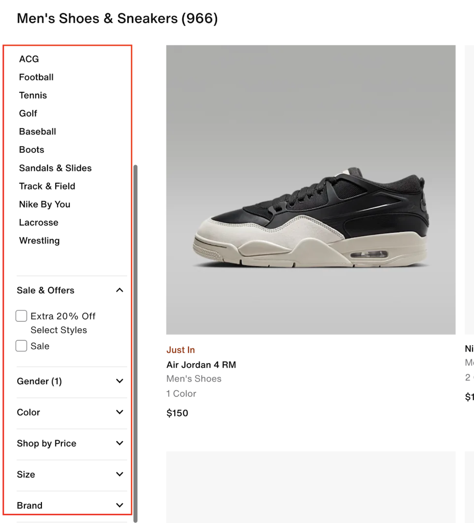
- If you run an e-commerce store, use faceted navigation to help users narrow their search using filters. This is an example from Nike’s website.
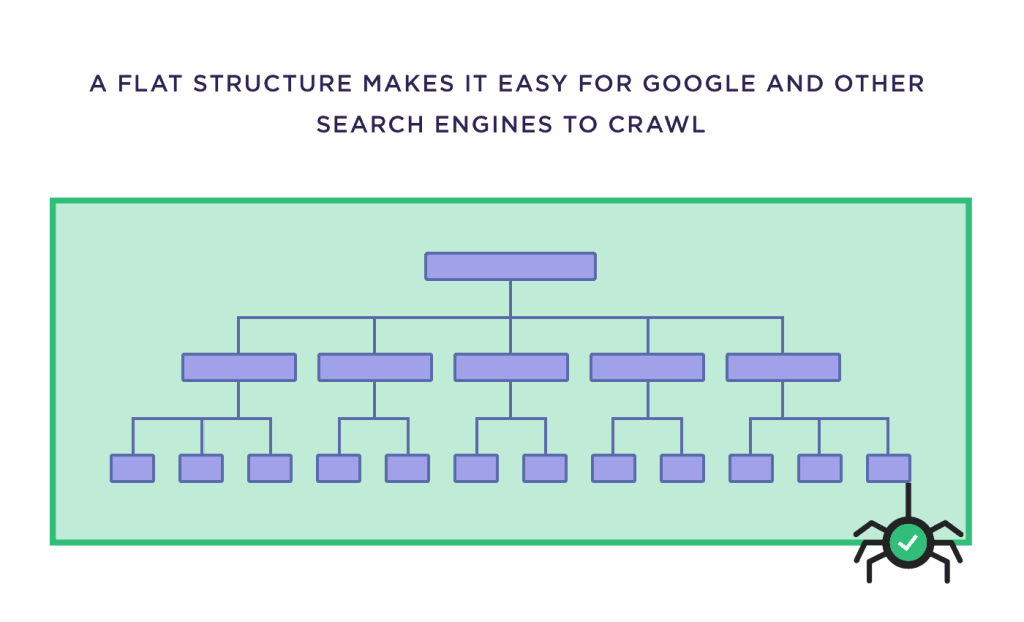
- Use a flat, organized site structure to help search engines crawl your web pages quickly. This is a good illustration from Backlinko:
4. Write for users:
This is a no-brainer.
Whether it’s your FAQ page, About Us Page or blog posts, all the content on your website should be written for your target audience. Even Google mandates blog owners to do the same:

Luckily, this applies even to small business owners as well. So even if you’re a local store creating user-first, helpful content, your website will perform well on search:

The tricky thing is that SEO isn’t solely about ranking on the search results. Don’t get me wrong; ranking is important. But on the UX side, it’s all about supporting your customers throughout their purchase journey—and beyond, i.e., becoming repeat customers.
So, ask yourself: How does my target audience move across the website or pages? What do they read? The goal is to become a trusted source of information for your users.
To do this, follow Google’s E-E-AT (Experience, Expertise, Authoritativeness and Trustworthiness) content guidelines. In simple terms, your content should:
- Show topical authority (experience)
- Give real-life, actionable strategies that answer user search queries. It should also be written by an expert, especially YMYL (your money, your life) content like health and finance (expertise)
- Attract relevant backlinks from other reputable websites (authoritativeness and trustworthiness)
Google has a handy content evaluation guide to help you gauge your content quality accordingly:
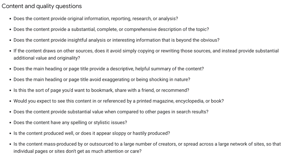
You can check the complete guide here. If you want something more detailed, snag this free E-E-A-T evaluation guide template from Backlinko or read more here.
Other basic to-do’s are:
- Ensure your content is skimmable, informative, readable, original and free of grammatical errors. (Use Grammarly to check for errors and Hemmigway for readability)
- Use bullet points or bold fonts to make your content skimmable
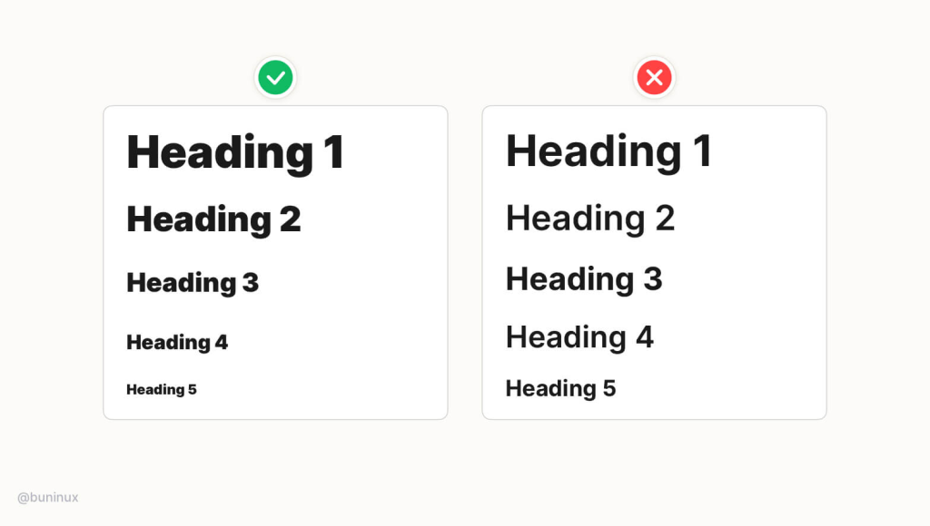
- Stick to one header per page. Your page headings should follow this hierarchy:
Another thing you need to consider is page experience. You can fulfill all of Google’s best practices for writing quality content, but if the page experience is poor, users will abandon your sites, which throws all your SEO efforts down the drain. Last year, Google included page experience as a necessity when creating helpful content:

To create an impactful page experience for users, ask yourself:

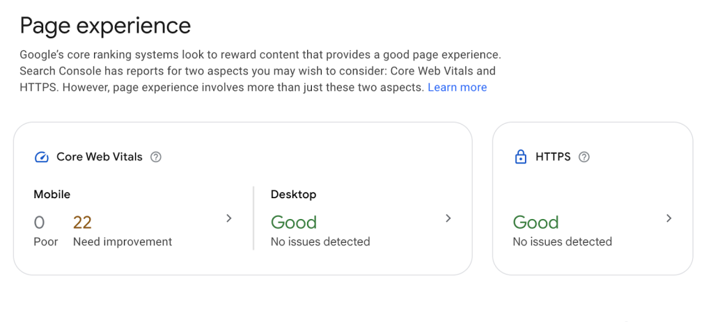
Google evaluates page experience using the core web vitals – metrics measuring user experience on a page or site. You can access this report on Google Search Console:
To improve your page experience:
- Run a site-wide and page audit to ensure there are no broken links and pages (I’ll share more about this in the next section)
- Ensure you’re using HTTPS – it tells users your website is secure and encrypted. It shows a padlock sign on your website:

- Update all your software updates, including plugins and themes
- Ensure there are no pop-up banners on your page. If you must have them, provide an easy way to dismiss the pop-up.
- Remember to make your website accessible to users in compliance with the Web Content Accessibility Guidelines (WCAG). Use this free tool to run a quick check (it takes less than a minute), or check out this guide for eleven (11) best practices you can implement right now.
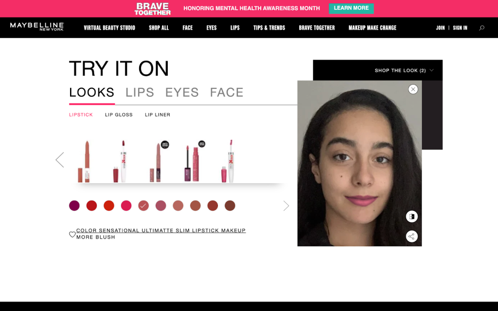
- Use interaction design (IxD) elements to allow users to interact with your website. This improves the time spent on the page, reduces the bounce rate and ultimately provides a better page experience for users.
For example, adding virtual product testing using augmented and virtual reality technology in your ecommerce store to allow users to try on products virtually:
5. Ensure there are no broken links and pages:
Broken links and pages can also affect user experience on your site.
When users land on a broken page or click on a broken link, they get redirected to a page that looks like this:
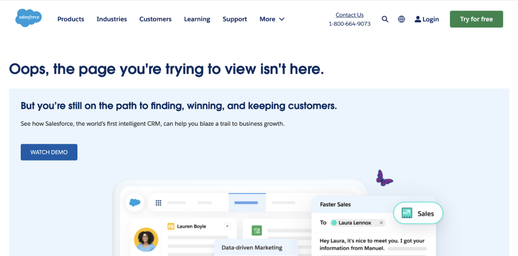
This shows that your website performance is not up to date, and it can cause users to find a competitor with a better, more updated website. It sucks, especially if it’s a page that is supposed to convert visitors.
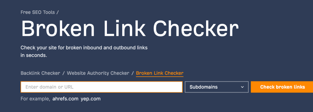
The easiest way to find broken links on your site is to conduct a website audit using any SEO tool – Ahrefs or Semrush. Ahrefs has a free tool, “Broken Link Checker”, that allows you to see all the pages with broken links on your website:
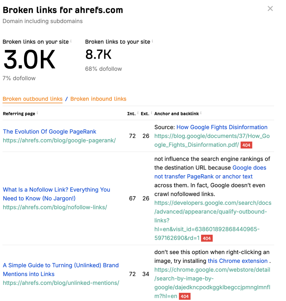
You’ll get a detailed report showing all the broken links, pages and URLs:
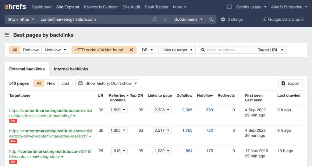
Better, if you have an account with them, check “Site Explorer” for a more detailed report:
Tip: To address broken links, manually update all the links to redirect users to the correct pages. Remove the links from the page for pages that no longer exist. If you have broken pages, use 301 redirects to redirect one URL to another to point users to the functioning ones.
6. Use a responsive design but prioritize mobile-friendliness:
Did you know mobile accounts for over 80% of all Google visitors? And 60% of these users say they found a new company or product after researching on their mobile phones. This means if you’re yet to optimize for mobile, you’re missing out on a huge opportunity for higher rankings and conversions.
Prioritizing mobile-first design means designing your website for mobiles first, i.e., for small screens before larger ones. I recommend using a responsive design because it enables your website to adapt to different screen sizes, whether desktop, mobile phones or tablets. This way, you can cater to users searching for your product or service on other devices.
Tip: This is on the technical side. I’d advise hiring a web designer to implement the design for you. This way, you’ll be sure all the elements on your page function properly in search.
However, you can test for mobile-friendliness using Google’s free mobile-friendliness tool. You can also check the top devices your web visitors use on Search Console to know which to optimize for. In the image below, mobile phones and desktops are the top two devices used by their searchers:

7. Keep track of the right metrics, test and re-iterate:
To stay on course and understand where to prioritize your efforts to improve the UX on your website, you need to keep track of the right metrics. These tell you if your UX/SEO strategies are working and what you need to improve to drive bottom-line revenue. At the end of the day, the goal is to increase conversions and the lifetime value of your customers.
Here are the top seven metrics you can start tracking right now on Google Analytics and Search Console:
- Conversion rate: This tells you how many visitors on your site complete a desired action, such as signing up for a newsletter, purchasing, or filling out a contact form. A high conversion rate means that your UX and SEO are good. Conversely, a low conversion rate means you need to improve your website performance or page experience.
Tool for tracking: Google Analytics.
- Bounce rate: This shows the percentage of visitors who leave your site after viewing your web page(s). These users leave without taking any action, indicating an issue with your website content, performance or design.
Tool for tracking: Google Analytics.
- Time spent on page: This is also the average session duration. It measures how long visitors stay on your site. A longer time on the page indicates that users find your website valuable and enjoyable.
Tool for tracking: Google Analytics.
- Core web vitals are a set of metrics that evaluate your page’s performance, usability, and visual stability.
Tool for tracking: Google Search Console.
- Dwell time: This is the time a visitor spends on your page before returning to the search result. It measures content “relevance” or “depth.”
Tool for tracking: Google Analytics.
- Click-through rate: This measures how often users click on your links, whether in the search results, email campaigns or calls to action on your website.
Tool for tracking: Google Analytics.
- Scroll depth measures how far users scroll down a page, giving you an idea of how much content they consume. A good scroll depth means your content is engaging and valuable to your readers.
Tool for tracking: Google Analytics.
Conclusion:
The lifeblood of UX and SEO is user data. It’ll be difficult to excel in both fields without a thorough understanding of your users, and you only get this data by doing the dirty work – research. One actionable and sustainable way to do this is to implement surveys throughout the user journey. For example, you can embed a pop-up poll when users land on your page or send an in-depth questionnaire to your current customers to learn how you can serve them better. This way, you can always get precise feedback on improving your customers’ overall user and search experience.
