How to Make Your Website ADA Compliant
Key Takeaways
- Over 98% of US web pages are not ADA-compliant, despite 1.3 billion disabled people worldwide.
- The Department of Justice mandated WCAG as the standard for accessibility compliance in the absence of federal regulations.
- Websites must meet four quality checks to be inclusive: perceivable, operable, understandable, and robust.
In 2019, Guillermo Robles, a visually impaired man, filed a lawsuit against Domino’s Pizza because he could not order food on the website or mobile app using a screen reader. The court ruled in favor of Guillermo because Domino’s website violated the ADA (American Disabilities Act) website accessibility guidelines.
This suit cost them $4000 in damages under California’s Unruh Act.
There are over 1.3 billion disabled people – which accounts for 16% of the global population. Despite this, over 98% of US web pages are not ADA-compliant.
However, in the absence of federal regulations, the Department of Justice (DoJ) mandated that the WCAG (Web Content Accessibility Guidelines) be made the standard for accessibility compliance.
These accessibility guidelines are divided into three tiers: A, AA, and AAA, with A being the minimum and AAA the highest.
Principles of Website Accessibility
An inclusive website must pass four quality checks. It must be perceivable, operable, understandable, and robust (POUR):
- Perceivable: Users should easily identify your web content and elements using their senses — sight, touch, or hearing.
- Operable: Users should be able to navigate your website or access your web content without strain.
- Understandable: Your website content and elements should be consistent, predictable and comprehensive.
- Robust: Your website content should be compatible with diverse tools, platforms, screens, and browsers, including assistive technology tools used by people with disabilities.
How to Make Your Website ADA-compliant
Here are 11 ways to improve your website’s accessibility through the website ADA-compliance policy:
1. Ensure all non-text content has a descriptive alternative:
Rule: Provide text alternatives for any non-text content so that it can be changed into other forms people need, such as large print, braille, speech, symbols or simpler language.
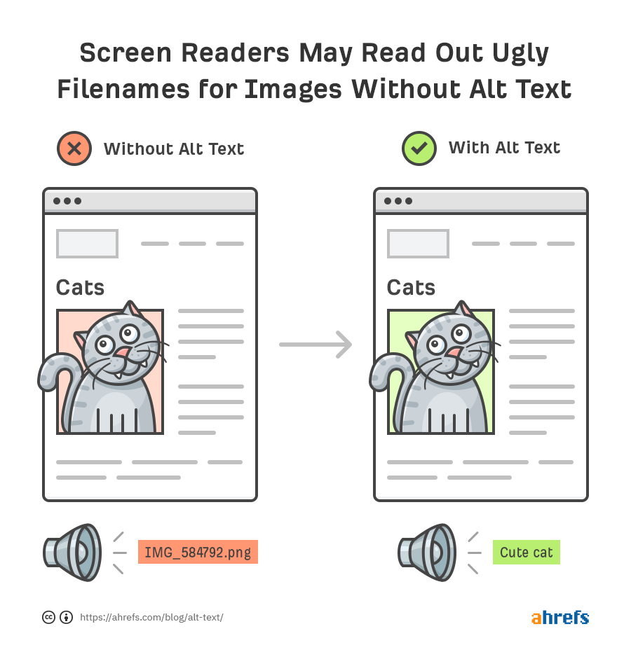
Visually impaired people rely on assistive technologies (AT) to translate non-text content into readable/audible formats. Without descriptive alternative texts (alt texts), users in this category will miss the important information you convey via images, videos, or other multimedia content. This is even more important if you run an eCommerce store or business that relies heavily on images. See this example from Ahrefs:

Here are the things you need to do:
- Ensure that all non-text content, such as images, illustrations, charts, etc., has a text alternative (alt text) that describes its content.
- The alt text should be simple, short, and descriptive. You can add your primary keyword if you’re also trying to optimize for SEO.
- If you’re using CAPTCHA on your site, provide a text alternative that describes its purpose, not interpreting the challenge. Also, instead of using image-based CAPTHAs, consider other accessible alternative forms.
- You don’t need to add an alt text for decorative images like memes or charts since assistive technologies can ignore it. Better, add the alt attribute (alt=””) without the text to indicate that the image is decorative and does not convey any meaningful information. In short, screen readers can skip over the image, as it is purely for visual enhancement.
- For image maps or submit buttons, add text content above or below that describes its purpose to users.
2. Add transcripts & captions for video & audio content:
Rule: Provide alternatives for time-based media.
If your website contains video or audio content (especially for course creators), it’s important that you consider people with hearing or visual impairments to make your website ADA-compliant.
You need to provide text alternatives—transcripts for audio and captions for videos—to help users access your content. For example, people who are deaf or blind can easily read the text in braille.
- For audio content, provide a full transcript of the recording for users with hearing disabilities. Also, add a text that tells the user where and how to download the audio transcript.
- Video content should have synchronized captions. If your video does not have audio, for example, orchestras, how-to videos, or games, use text alternatives to describe the information it conveys.
- Don’t exclude the minute details. Include texts of non-speech information conveyed through sounds.
- If you’re hosting a live stream or broadcast that includes audio, ensure the captions are generated in real-time, including other relevant audio information such as sound effects or speaker identification.
- Have a sign interpreter translate the audio and video content into sign language to help individuals who are hard of hearing understand your content.
Tip: If your video and audio content are alternatives to text content on your website, then there’s no need to provide transcripts or synchronized captions since users can easily access that on your web page.
3. Design content to adapt to different layouts/formats/screens:
Rule: Create content that can be presented in different ways (for example, simpler layout) without losing information or structure.
The way users access and interact with content differs. The tools and platforms they use to perform tasks also vary.
That said, it’s vital to design your web content to adapt to the different layouts, screen sizes, formats, and tools searchers use when surfing the internet. This way, you don’t lose your potential customers due to poor user experience.
- A good start is using an adaptive or responsive layout to adapt your web page to user preferences. These layouts also help to improve user experience by ensuring consistency and visual appeal across various screens.
- Use HTML header tags to show the hierarchical sequence of your web content. The H1 tags are for the primary topic of a web page and should only be used once. Your H1 tag shouldn’t appear twice in your web content. Instead, use H2s – H6s to organize succeeding page sections.
Readers who rely on assistive technologies need this structure to navigate your web content and understand the relationship between the various sections. Using headers correctly also improves your web architecture, which impacts your site’s SEO.
- Use descriptive names for controls, icons, or links on your website. For context, instead of labeling a button as ‘Click Here,’ use a more descriptive label like ‘Submit Form,’ or ‘Download PDF.’
This is why our web design services priorities include custom web design, SEO-friendly design, and user-focused layouts. These make your website ADA-compliant while providing an exceptional online experience for your customers.
4. Ensure your content is easy to see, read and hear:
Rule 4: Make it easier for users to see and hear content, including separating foreground from background.
Remember what I shared earlier about ensuring your content is perceivable by the senses? Yes, it applies in this case.
It’s not enough that your content is informative, actionable, and optimized to rank on search results. What’s the benefit if all your customers can’t understand or access it? The job isn’t complete until your content is accessible.
- Don’t solely use colors to convey critical information, as visually impaired readers will not see it. Instead, underline or bold text highlighting key points (or links).
- Symbols and icons can also help to emphasize important information in your text. For example, if you need to indicate required fields in a form, use an asterisk (*) and a color change.
- Provide enough contrast between your web content and the background to help people with low vision (middle-aged and older people fit this category). WCAG recommends a contrast ratio of 4:5:1 for large text and 7:1 for standard text to achieve Level AAA compliance. This also applies to texts within an image.
- If you’re using a larger text (with <18pt or <14pt bold), use a contrast ratio of 3:1.
- If your audio content or background sound plays automatically, provide an option that enables readers to lower the volume or turn it on/off. Background audio may interfere with screen readers’ speech output, which can confuse users relying on these tools to read web content.
- Some users can only read texts when they are larger. So, provide options for users to increase the font size of your web content. WCAG recommends that web content be scalable up to 200% (2X its usual width and height) without distorting the design and layout.
5. Make sure your website is accessible via a keyboard:
Rule: Make all functionality available from a keyboard.
In this guideline, you’re required to make your website content operable via keyboard and not just mouse. This is specifically for blind people or those who are mobility-impaired and rely on keyboard navigation due to their condition.
- Ensure that all interactive elements on your website—links, buttons, and form fields—are accessible via keyboard.
- Try using the Tab Keys to move between different elements of your content. Is it navigable? Also, check if you can access linked texts using the ‘Enter’ key.
- If your web content has keyboard shortcuts, ensure readers can turn them off or reconfigure to their preferences. This keeps users who rely on keyboards from making mistakes.
Overall, all parts of your website should be accessible via keyboard navigation.
6. Provide enough time for users to interact with your content:
Rule: Provide users enough time to read and use content
Do you have a web page with time limits on your website? Sites selling tickets or requiring logins are common in this category. If you do, it’s important that you allow users to adjust or turn off time limits if they need to. The only exception is if your time limit is longer than 20 hours.
Also:
- If your website includes forms that time out after a certain period, offer options that allow users to extend the time limit.
- Alternatively, if a session is about to expire, give readers a warning beforehand and an option to request more time. This ensures everyone, including users with cognitive limitations, can complete their tasks without feeling rushed or exhausted.
- Provide options to cancel or turn off updates on your website that may interfere with browsing except in emergencies.
7. Use a minimalist web design:
Rule: Don’t design content in a way that is known to cause seizures or physical reactions.
Readers with photosensitive seizure disorders are easily triggered by flashy content and, as a result, will find it difficult to view content with frequent or intense flashes. This is why some of our web designs are minimalist in style (without compromising user experience or conversions).
For minimalist web design that is ADA compliant, do these:
- Use blinking buttons sparingly and with care. Although blinking and flashing are not the same, with the latter less fatal than the former, it would be considered a flash if it persists.
- Limit the flash to an area of 341 by 265 pixels or less.
- As the rule states, use minimalist web design. If you must include flashing content, record it in a video format so users can turn it on/off.
- Display warnings on your web page to notify users that the content contains flashy images/animations.
- The accepted standard for a flash is a luminance of 20 cd/m2.
8. Provide tools to help users navigate your content
Rule: Provide ways to help users navigate, find content and determine where they are.
It’s important that your web content is easily accessible and navigable. Readers should be able to find what they’re looking for without surfing the entire website and using a keyboard. Luckily, there are a handful of ways to do this to ensure it is inclusive for all:
- Use descriptive texts for links within your web content. Instead of vague labels like ‘Click Here,’ use complete sentences that clearly describe the link’s destination or labels. The same applies to buttons and icons on your page. This helps users rely on screen readers to navigate your web content.
- Ensure you use a well-defined, clear page title that describes the web page’s purpose. This helps users to find what they’re looking for faster and increases your chances of topping the search results for relevant queries.
- Implement breadcrumbs navigation on your website to help users easily know where they are on your site and find their way back to previous pages if necessary.
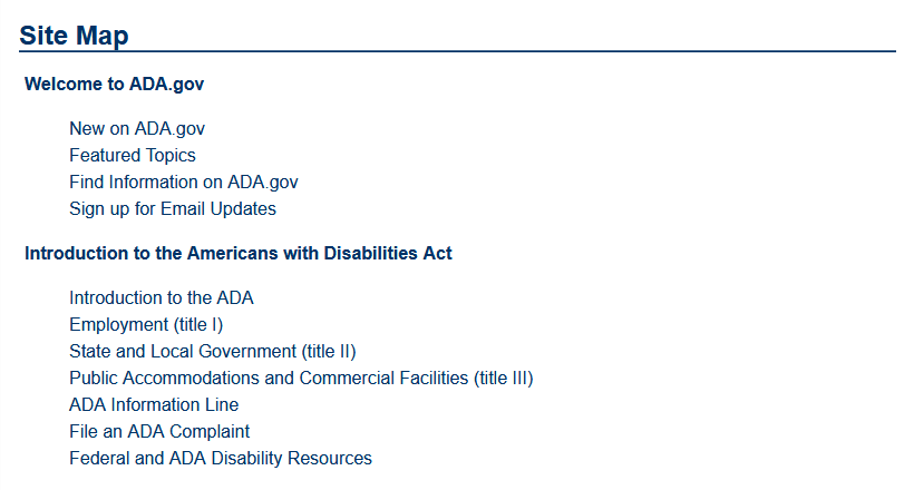
- Provide a site map (especially if your website has many pages) to help users quickly find the content they need.

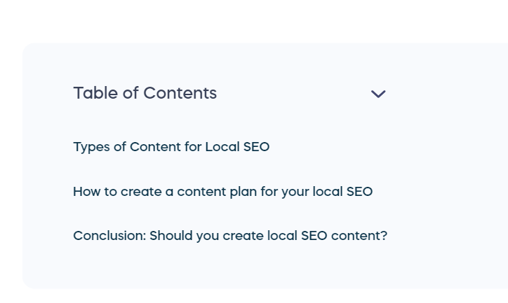
- You can also use tables of content for web pages. See this example from one of our blog posts:

- Break up web content into sections using relevant headings (H2s, H3s, etc.). This makes it easier for users to scan through your content to find what they’re really interested in.
9. Ensure your web content is concise, readable and understandable
Rule: Make text content readable and understandable.
Your web content is one of the most important elements of your website. In fact, your website won’t be discoverable in the search results without it. But it’s not all about creating content. For accessibility and to meet ADA compliance, your content should be readable, understandable, and grammatically correct.
Here’s how:
- Use simple words. If you’re using abbreviations or words in other languages, ensure you add the full meaning to help readers understand faster.
- Always indicate the dominant language of your web page. This allows assistive technologies to interpret and convey the content to users properly.
- If you need to use industry nuances or unusual terms in your content, include the definitions in a glossary or at the bottom of the page.
10. Ensure consistent content layout and design across all pages
Rule: Make web pages appear and operate in predictable ways.
Imagine you visit a web page that looks and operates differently from other pages on the same website. This inconsistency can be confusing and cause you to look elsewhere for answers.
This is the impact of a poor user experience (UX). Not only can it increase your bounce rates, but it also affects your SEO performance. Research validates this, as 88% of web users are less likely to return to a site after a bad UX.
To avoid this:
- Ensure all your web pages follow a consistent layout and design.
- Use the same navigation menus, button styles, fonts, and page structure throughout your website.
- Minimize or avoid sudden changes in content, as this may cause difficulties for blind people or people with cognitive limitations.
This helps users build a mental model of your website. It also enables them to predict where to find specific content and know how to interact with different elements on your page.
11. Using accessible fonts for people with dyslexia
Dyslexia is a learning disability that makes reading, writing, and spelling difficult for an individual. According to research from the Yale Center for Dyslexia, 1 in 5 Americans have dyslexia. This also represents 80 – 90 percent of people with learning disabilities.
For inclusivity and website ADA compliance:
- Use dyslexic-friendly typefaces such as Sans Serif, Ariel, Comic Sans, Helvetica, or Calibri to help people with this condition improve readability and reduce strain.
- Ensure there’s enough spacing between letters and words.
- Use a minimum of 12-point font.
- Avoid jargon; use simpler words instead.
Conclusion
The first step to making your website accessible is to understand why it’s important in the first place.
Web accessibility isn’t solely about making web content accessible to screen readers…that’s only a fragment. It’s more about creating a universal experience that allows anyone to access your website (and its content).
We do this for our clients, and we take it a step further by building responsive website designs that convert visitors into sales/customers! The process helps us tackle technical SEO issues, fix low engagement rates, and increase visibility on search engines.
The best part about website accessibility is that it improves user experience, which impacts overall SEO performance. To make your website ADA-compliant and increase your conversion rate, request a quote today!
