How to Effectively Display Infographics on Your Site
Infographics are an effective way to hold readers’ interest and help explain the nitty gritty details of complicated or mundane topics in an exciting and visual way.
Whether you want to hire someone to make an infographic for your site or you want to make it on your own, you might run into some challenges.
For example, if your infographic doesn’t have some structure, viewers won’t be able to dissect the information easily, and you might lose their attention.
And if you don’t know how to display your infographic, all of your hard work could go to waste.
Lucky for you, we created this post that explains how you can effectively display infographics on your website.
But before we dive into that, let’s go over why adding infographics to your site can contribute to its success.
Why adding infographics to your site is important
When infographics are designed and displayed well, they can turn complex topics or boring statistics into exciting visual content.
They can also be used as a tool to drive traffic to your site. Infographics are liked and shared across social media three times more than other kinds of content.
Infographics are shareable and informative. This makes them a useful conversion path that can help you generate more leads.
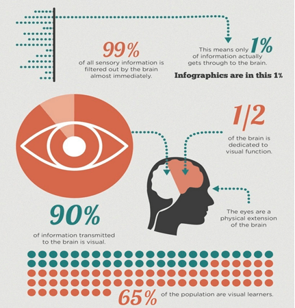
Of all your site visitors, the majority of them (65%) learn visually. The reason for this is likely because visual content is typically easier for people to process than written content is.
The human brain can understand visuals up to 60,000 times quicker than it can process written words.
By creating infographics and adding them to your site, your customers will be able to digest complex topics easily and learn quickly.
On top of that, they can also help to boost your site’s traffic. Research shows that infographics have the potential to increase website traffic by 12%.
Now that you know why infographics can be helpful for taking your site to the next level, you might be wondering how to structure them. We’ve got you covered.
How to structure an infographic
An infographic that does its job well has to have a clear structure.
If the data in an infographic isn’t organized well, viewers won’t be able to unpack the main points.
When you focus on the structure of your infographic first, you can base its visual design around the data.
For example, you don’t want to have too much or too little information, and you should always group data together into categories to make it easier to understand.
Once you gather statistics and information and organize them, you can begin to create a design that is tailored to inform viewers and help them comprehend what you’re presenting easily.

Here’s an example of a well-structured infographic from the USDA about how healthy eating can help Americans save money.
The data is presented in such a way where the audience doesn’t have to work hard to grasp what the visual is showing and explaining.
There visual is organized into three main sections:
- We’re in the red.
- Healthy eating can help…but first, we need to do it.
- What’s the return on our investment?
Emulate a similar approach to your brand’s infographics. With your structure, highlight key findings, provide clarification, and outline any key trends.
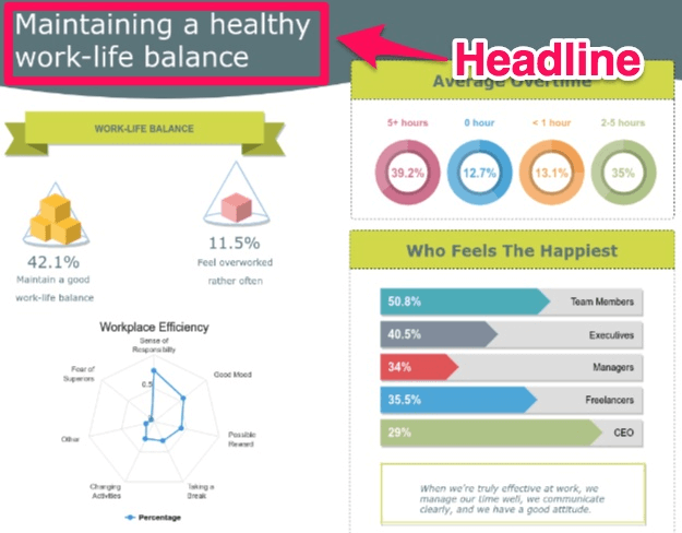
Always start off with a headline or title. This line should explain what the main point of your infographic is.
If you want to add a brief introduction or description that hooks your reader, do that next.
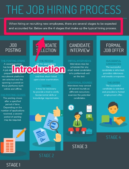
Try to keep it as short as possible to pique viewers’ interest and convince them to keep reading the rest of the graphic.
From here, add in the main content. Use charts, icons, and other visual indicators. Identify any subcategories and subtopics by grouping similar statistics and information together.
For example, you could break down the pros and cons of an idea into separate categories or explain the steps involved.
At the end of your infographic, you can add in a conclusion that summarized the main points of your graphic if you wish.
Don’t forget to create a call to action, also known as a CTA, if it relates to the visual. Nearly half (47%) of all websites have a clear CTA that takes users three seconds or less to find.
Your infographic’s CTA should be an image and/or piece of text that directs viewers to take a particular action, like signing up for your email list or visiting a specific page on your website.
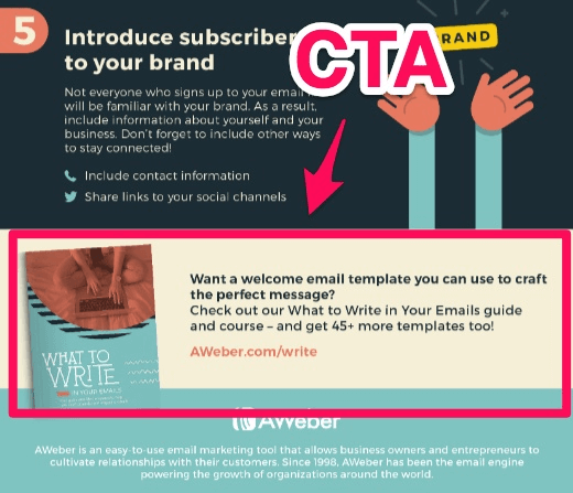
Here’s an example of a solid CTA at the end of an infographic from Aweber.
Next, write a blog post where you can include your infographic.
Write a blog post where you can display your infographic and create an embed code
Once you’ve created an infographic that you can be proud to present, you need to create a page to display it on.
One option is to write a blog post where you can display your infographic. If you don’t have a blog, this is the perfect opportunity to create one.
Companies with blogs gain 67% more leads every month in comparison to companies that don’t have them.
This post should further explain the topic that your infographic is centered around. You don’t necessarily have to write tons of copy, but it could be beneficial to create a long-form post.
Long-form posts on blogs generate up to nine times more leads than short-form blog posts do.
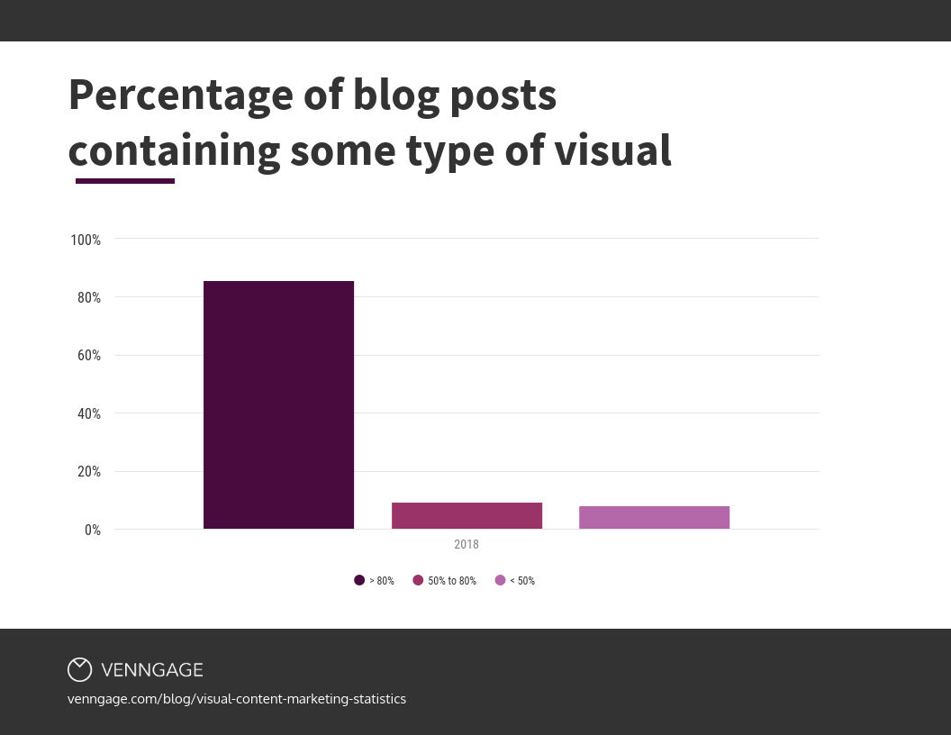
On top of that, nearly 85% of marketers said in a recent study that more than 80% of their blog posts contained some visual.
The same data shows that about 9% said that only 50% to 80% contained at least one kind of visual, while 8% said that less than half of their posts included visuals.
Once you’ve written your blog post, you’re ready to add it to your site.
Before doing this, make sure that your infographic is the correct size so that it looks as high quality as possible.
There’s nothing worse than clicking on an image only to see a blurry photo that is unreadable.
Most infographics are usually at least 800 to 1,000 pixels wide. Make sure that your infographic image is sized correctly and easy to read before uploading it to your site.
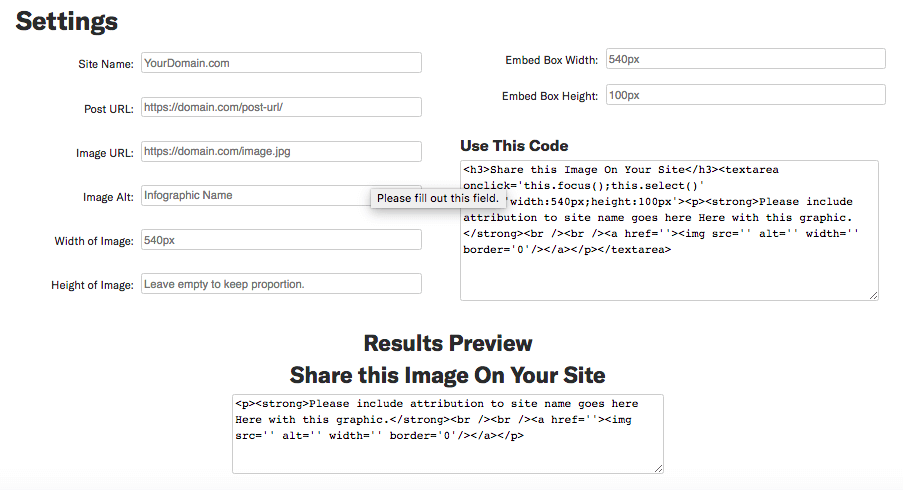
To make an embed code for your infographic, use a tool like Siege Media’s Embed Code Generator.
This tool helps you generate an embed code that makes your infographic easier to share while ensuring that people who publish your infographic will include a link back to your site.
In the “Site Name” box, enter in the URL that you want to be attributed to the infographic. This action will help ensure that your site gets credit when someone else shares your infographic.
In the “Post URL” box, add the URL of the site page where the infographic will be posted. If you’re going to add the infographic to a blog, enter the URL for that post here.
The “Image URL” section should include the URL of the infographic file on your site.
In the “Image Alt” box, write some alt text that explains or describes your infographic. This box is a good place to include the title of the infographic.
The “Width of Image” box should include the width that you want the embedded infographic to be.
Siege Media recommends leaving the “Height of Image” box blank to ensure that the infographic will display proportionately on another website regardless of its width.
Once you’ve filled out this information, copy and paste the code generated by the tool into the HTML of the page on your site where you want the embed code to appear.
It might be most practical to put this code below the infographic so that viewers will see the code once they’re done looking at your image.
Now that you know how to display infographics on your site, you should also think about sharing them on social media for maximum exposure.
Share your infographic on social media and include social sharing options
A whopping 80% of marketers say that they use visual assets when marketing on social media.
And there’s a good reason they do. Tweets that include images get 150% more retweets, 89% more likes, and 18% more click-throughs.
Share your infographic across all of your social media accounts along with a link to the web page where the graphic can be found.

Sharing gives your image more chances to reach the right audience, gain views, and get shares. Here’s a real-life example of this tactic in action on Visual Capitalist’s Twitter page:
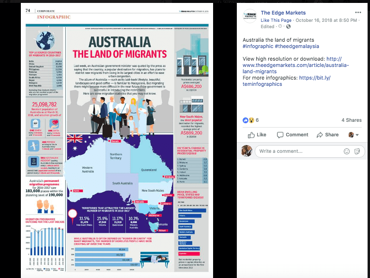
And here’s an example of an infographic shared on Facebook by The Edge Markets:
Keep in mind that you might need to share a resized version of your infographic on social media due to image size guidelines on each platform.
Here are some image size recommendations for some popular social platforms, according to SproutSocial.
- On Twitter, the minimum size to appear expanded is 440 x 220 pixels, while the maximum size to appear expanded is 1,024 x 512 pixels.
- On Facebook, the recommended upload size is 1,200 x 630 pixels.
- On Instagram, image sizes have been increased to 1080 x 1080 pixels, but Instagram still scales photos down to about 612 x 612 pixels.
- On Pinterest, expanded pins have a minimum width of 600 pixels, while height is scaled.
You should also consider adding social sharing buttons above, below, or beside your infographic to make it easier for others to share it.
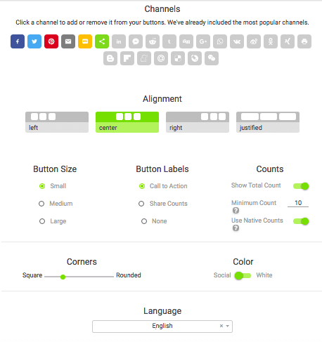
To create free social sharing buttons, use a tool like ShareThis.
With it, you can choose which social channels you want to include in your buttons, how you want to align them, what size you want them to be, and more.
The tool will generate a code that you can copy and paste to the site page where your infographic is located.
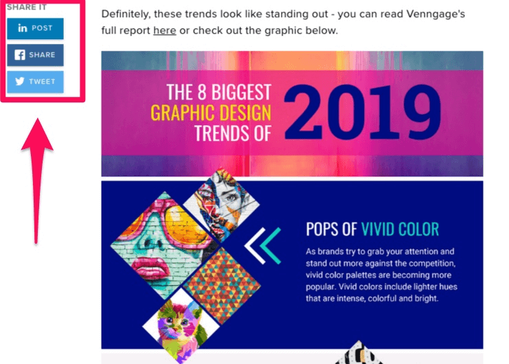
The finished product should look something like this once the code has been added to your site:
Once you tack these buttons on to your infographic’s web page, there will be virtually no work involved with sharing the image.
All viewers will have to do is click the button of the desired social platform they want to post it on.
Conclusion
Compared to other forms of content such as written content, infographics can explain complicated or boring data in a visual way that holds viewers’ attention.
The benefits don’t stop there. Infographics are liked and shared on social media more than any other kind of content, and they can even boost web traffic.
But an infographic has to be executed well in order to perform well. And you have to know how to display and share it to give it the most exposure.
- When creating an infographic, you should always design and organize the visuals around the data.
- Create a headline at the top of the image. Write a brief introduction that explains your infographic if you wish.
- Then, add in all of your graphics main content. Group text and icons into categories.
- Add a CTA that presents viewers with an action to complete at the bottom of the infographic.
- This desired action could be to sign up for your email newsletter or to view a different page on your site.
- Next, create a blog post where you can display your infographic. Add an embed code to the site page where your infographic is posted so that others can easily share your image.
- Finally, share your infographic with your followers on social media for maximum exposure. Add social sharing buttons to your infographic by using a tool like ShareThis.
That way, viewers who want to share your image to their own social media pages can do so with the press of a button.
Start structuring and displaying infographics correctly today to reap all the benefits that they can bring.
