7 Ecommerce User Experience Quick Wins (Making Your Visitors Happy)
Optimizing ecommerce user experience might seem like a daunting task. There are so many variables. Where should you even begin?
When you feel overwhelmed, remind yourself that ultimately, user experience is about removing friction and guiding the customer through the sales funnel to make their online shopping experience easier.
And you don’t need to completely redesign your ecommerce site in order to make it easier for the customer to buy your products.
In fact, sometimes changes that are relatively simple to implement can have a massive effect on your business, especially as the results compound over time.
So why don’t you start by focusing on quick wins?
#1 Improve Website Loading Speed
Website loading speed is the most overlooked aspect of user experience.
Google researchers have discovered that 53% of mobile visits are abandoned if the page takes more than 3 seconds to load.
Meanwhile, 70% of the mobile landing pages that they analyzed took more than 7 seconds to fully load.
It’s safe to say that these companies could significantly increase their revenues by optimizing their ecommerce websites for speed. They are missing a huge opportunity.
Don’t make the same mistake. Use Page Speed Insights to analyze the speed of your website. Then, optimize it so that it would fully load in less than 3 seconds.
Keep in mind that a delay as short as 100 milliseconds can have an effect on the conversion rate, so every additional second is pretty much guaranteed to hurt your bottom line. You can typically improve this dramatically by optimizing your product images by compressing them and leveraging browser caching.
#2 Add a Call-to-action Button to Your Homepage
When people land on your website, don’t just let them aimlessly wander around, nudge them towards the next step in your sales funnel.
You can do that by adding an above the fold call-to-action button that immediately grabs the visitor’s attention.
This is the first thing that Google recommends in the homepage/landing page section of their “UX Playbook for Retail” because it is easy to implement but has a high impact.
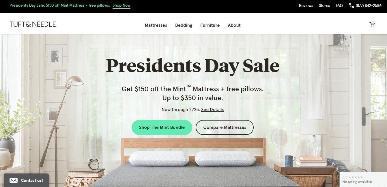
For example, take a look at the Tuft & Needle homepage, where they use a bright call to action button that stands out in the overall color scheme to direct the visitors to The Mint Bundle product page.
Note how various elements complement each other. The headline, the subheadline, the color and the copy of the call-to-action button… They all work together to get the visitor to click on “Shop The Mint Bundle” and take another step towards making a purchase.
Once someone lands on your website, provide them with a clear direction in the form of a call to action button, and then use other elements on the page to reinforce that call-to-action.
#3 Feature a Prominent Search Bar
It’s important to note that staying on top of design trends and how that relates to the overall ecommerce UX is vital to success.
According to Google’s “UX Playbook for Retail,” users that search are 200% more likely to convert on average.
That is why they suggest making the search bar visible and then featuring it prominently (it’s another thing that is easy to implement but has a high impact).
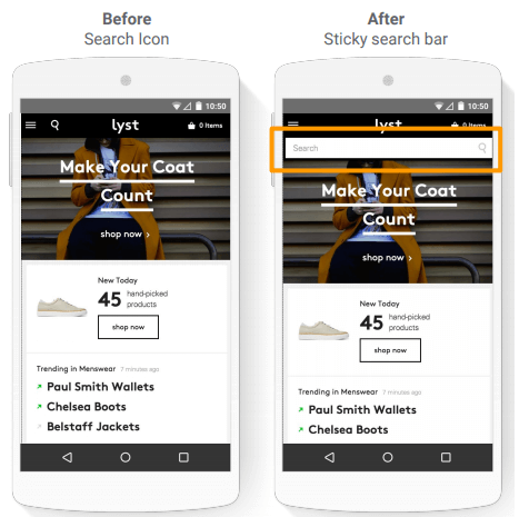
For example, when Lyst switched from displaying a search icon to displaying a search bar, their search usage increased by 43% on desktop and 13% on mobile.
Search usage might not seem like an important metric, but since we know that visitors who use the search function are more likely to buy, it makes sense to encourage them to do it.
#4 Add Customer Reviews
People are now used to reading customer reviews before buying something online.
According to Fan & Fuel research, 97% of consumers say that reviews factor into their buying decisions.
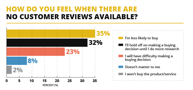
Meanwhile, 92% of consumers say that they are hesitant to make a purchase if there are no reviews available.
According to Spiegel Research Center, “As products begin displaying reviews, conversion rates escalate rapidly. The purchase likelihood for a product with five reviews is 270% greater than the purchase likelihood of a product with no reviews.”
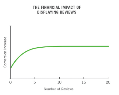
However, they also note that the first five reviews have the most impact, and after that, the marginal benefits of additional reviews start diminishing.
Adding customer reviews provides social proof that makes any product description more persuasive.
After all, everyone knows that you want to sell the product, so they expect you to sing praises to it. But what do people who bought it have to say?
For example, take a look at how Rainbow OPTX display customer reviews on their Blue Lens/Aviator Frame sunglasses product page.
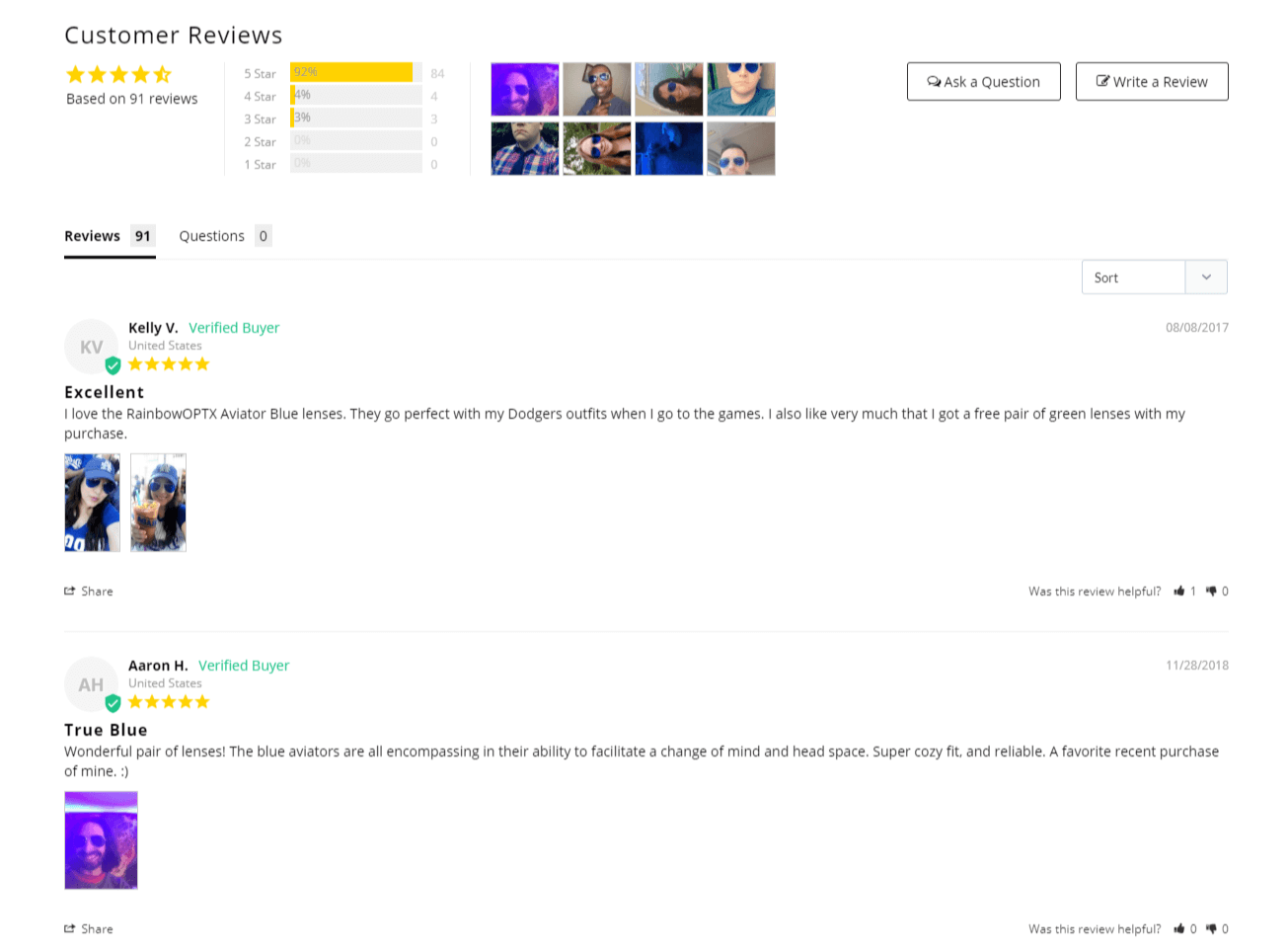
Note how customers can not only submit a review but also upload a picture of themselves wearing the sunglasses (this works great for brands that sell apparel and accessories).
It’s clear that consumers are wary of buying products that don’t have any reviews. And who can blame them? They can’t inspect the thing they are about to buy themselves, so they want some reassurance.
Moreover, when a brand doesn’t allow customers to leave reviews, it looks as if they don’t have confidence in their own products.
That is why it’s so important to enable customer reviews and then encourage people to review the products they have purchased.
Remember, the difference between zero reviews and five reviews is massive, so get on it asap!
#5 Don’t Redirect to the Cart Page after You Add to Cart
Online stores often redirect the customer to the cart page immediately after they add a product to their shopping cart.
However, this interrupts their shopping process and adds unnecessary friction, because now they have to leave the cart page in order to go back to browsing your inventory.
According to Google’s “UX Playbook for Retail” using a pop-up cart instead can help increase the average order value.
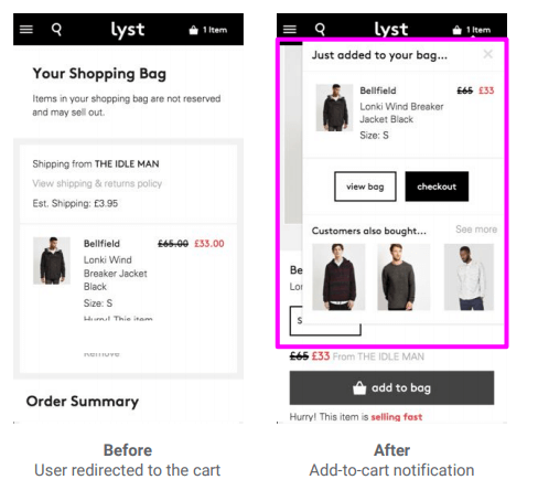
For example, when Lyst switched from redirecting to the cart page to displaying a pop-up cart, their average order value increased by 4%.
This allows the customer to continue shopping while also reassuring them that the product has indeed been added to their cart.
Don’t get in the customer’s way when they want to buy more stuff from you!
#6 Allow Guest Checkout
Baymard Institute surveyed over 2,500 adults from the United States to find out why people abandon their carts at the checkout.
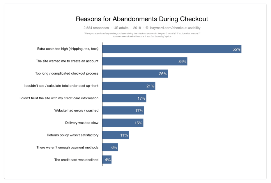
Here are the results that they got after removing the “I was just browsing/not ready to buy” segment:
As you can see, “The site wanted me to create an account” is the second most common reason for cart abandonment at the checkout.
In fact, there’s even a well-known story about how removing that barrier led to a $300 million increase in revenue.
Jared Spool from User Interface Engineering was hired by a major retailer to improve its online store.
The retailer had a checkout flow that required the customer to either create a new account or log into an existing account in order to complete their purchase.
The idea behind this was that creating an account would allow the customer to check out faster in the future and thus make shopping easier.
However, when Spool looked at the data, it turned out that 45% of all customers had registered several accounts, presumably because they couldn’t remember whether they had one already.
Moreover, customers were submitting 160,000 forgotten password requests a day, and 75% of those requests did not lead to a purchase.
It became clear that instead of making the customer’s life easier, the registration requirement was an obstacle that prevented them from completing their order.
Spool then replaced the “Register” button with a “Continue” button and added a disclaimer to let the customers know that creating an account was not necessary to make a purchase.
This led to a drastic increase in sales which translated to $300 million in additional revenue in one year.
In short, requiring people to register in order to buy your products is a bad idea, and if you are currently doing that, it’s probably costing you a lot of money. Stop it.
However, you want customers to create accounts because that allows you to collect data that you can then use to streamline and personalize their shopping experience. So what should you do?
The best approach is to provide the customers with an option to register while also letting them check out as guests.
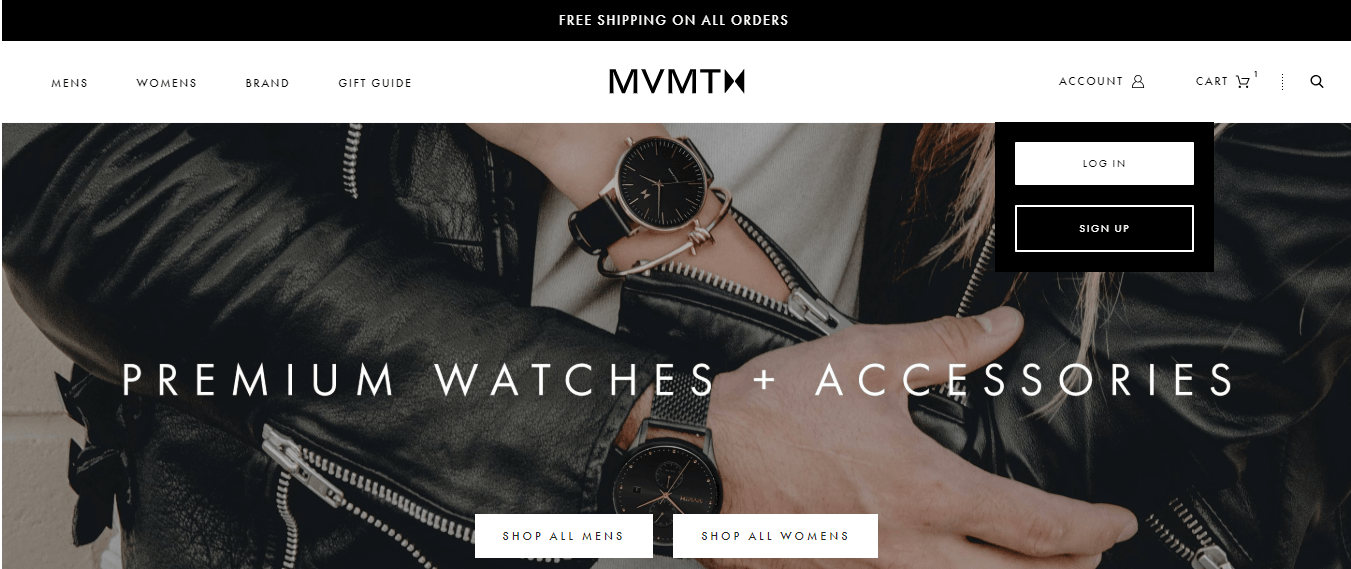
For example, MVMT has an “Account” tab in their homepage navigation, and if you hover over it you will be presented with the login and sign up options:
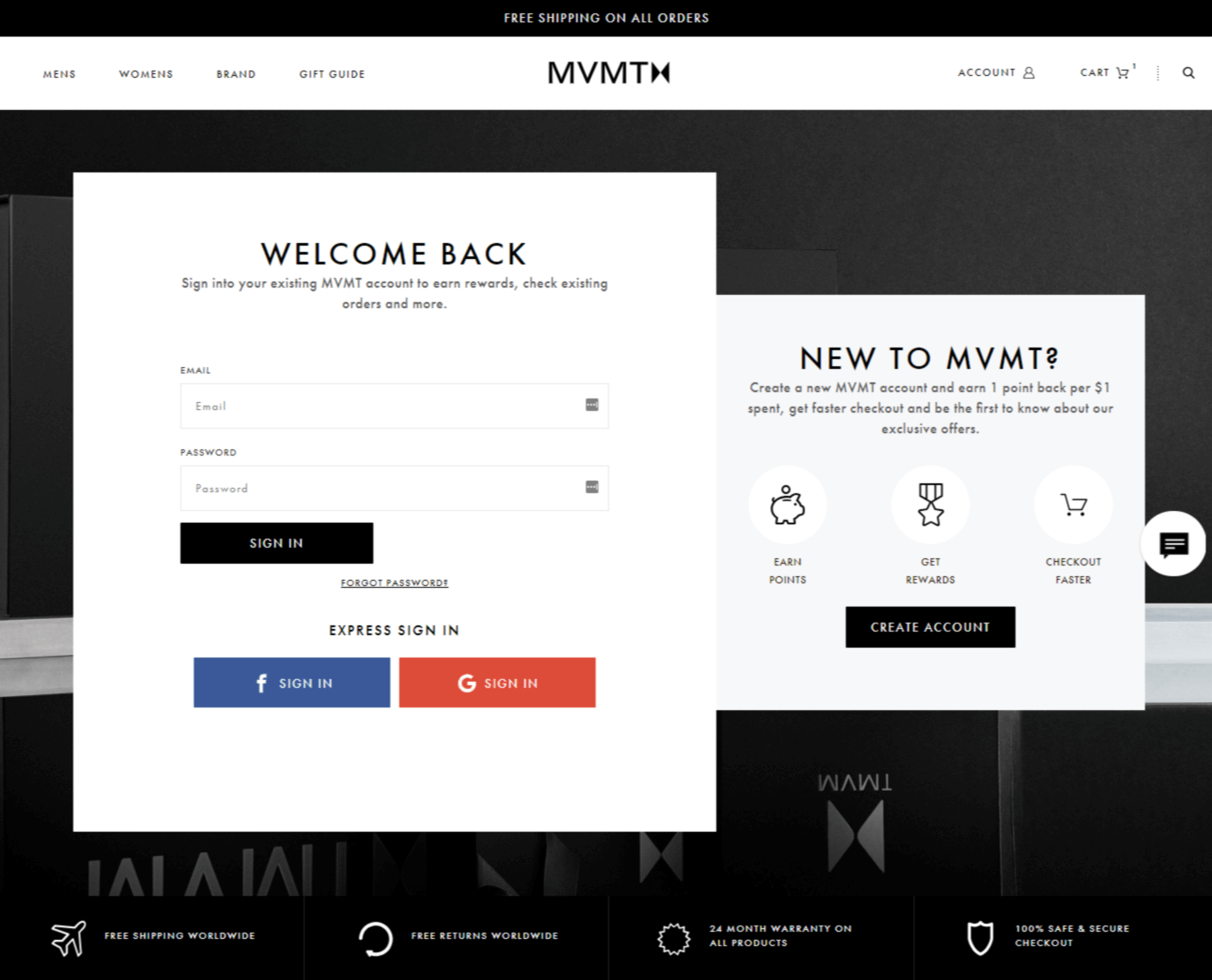
Meanwhile, if you click on it, you will be taken to a page where you can find more information about customer accounts:
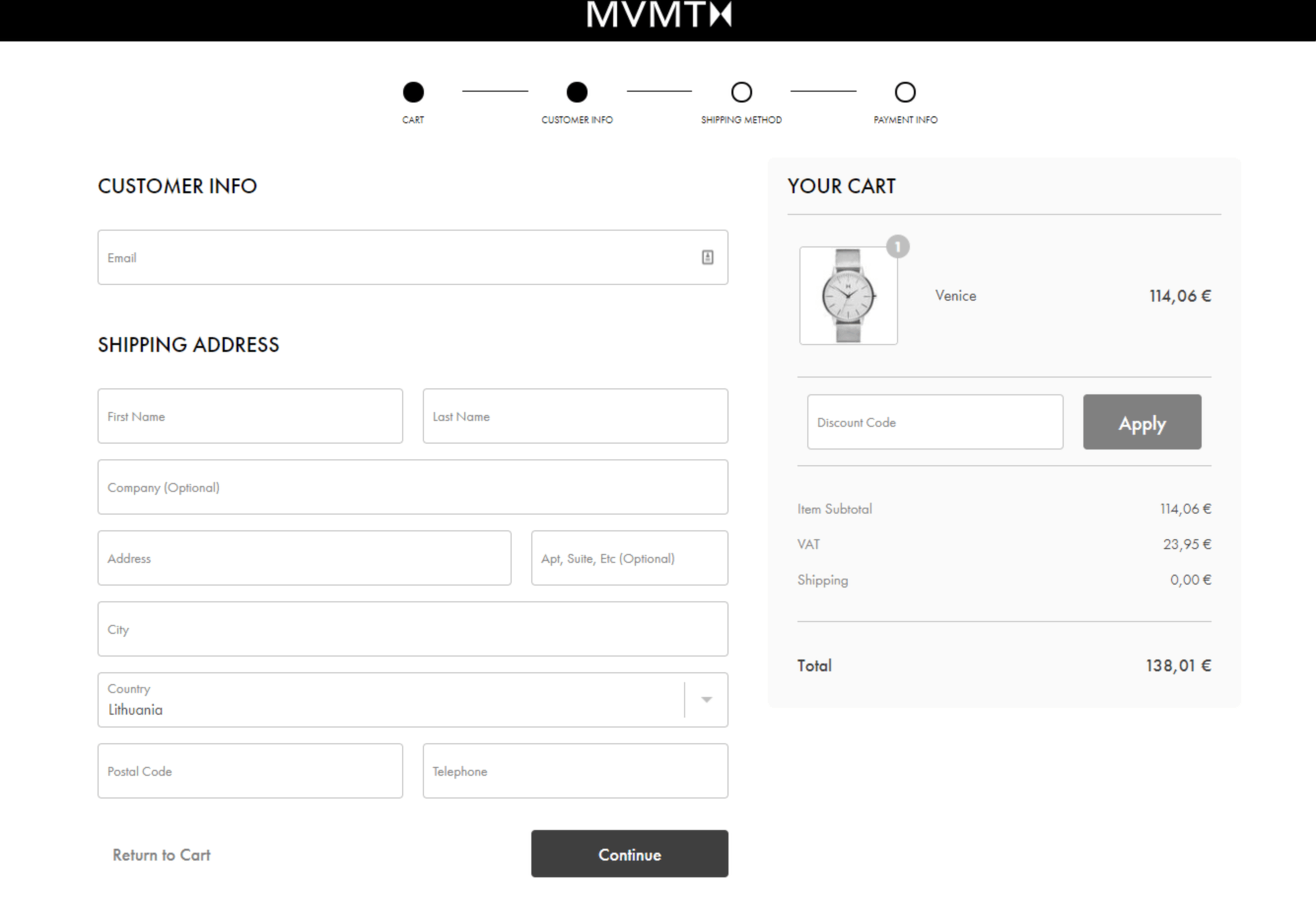
However, if you don’t have an account, you can always check out as a guest:
What is the lesson here? It’s okay to encourage customers to sign up, but don’t push it. They will do it in their own time if they like your products.
#7 Reduce the Number of Form Fields in the Checkout Process
No one likes filling out forms.
However, people understand that you need their information to fulfill their order, so they are willing to fill out the required fields to finalize their purchase.
You shouldn’t test their patience, though. The more fields a form has, the more likely it is to be abandoned. And most checkouts have way too many fields.
When Baymard Institute conducted a checkout usability study, they discovered that the average checkout flow has 14.88 form fields.
“Yet our checkout usability testing also reveals that most sites can achieve a 20-60% reduction in the number of form fields displayed by default.
In short: the average checkout display twice as many form fields as needed.”
But how can you reduce the number of form fields in your checkout flow?
The most important thing is to only ask for necessary information and nothing else.
For example, online stores sometimes ask customers for details like title, middle name, company name, etc. But do they really need all that? Probably not.
Also, according to Baymard, even optional fields add friction to the checkout flow:
“While it’s true that users aren’t required to fill out the optional fields, users won’t realize this until they progress to that field and see its ‘optional’ label. Hence, when users first glance over the page, the optional fields are as intimidating as the required fields (because the user has yet to distinguish the two), and can thus make a checkout step seem more intimidating to complete than it actually is.”
It’s best to remove every field that isn’t necessary for fulfilling an order.
Baymard also suggests these additional tweaks to reduce the number of form fields further:
- Instead of having separate “First Name” and “Last Name” fields use a single “Full Name” field.
- Use the shipping address as the billing address by default and hide the “Billing address” section behind a link.
- Hide all other fields that are not required but may sometimes be needed behind links (e.g., “Address Line 2”, “Company Name”, etc.).
They used Crutchfield’s checkout as an example of a well-designed checkout flow. It only has eight form fields.
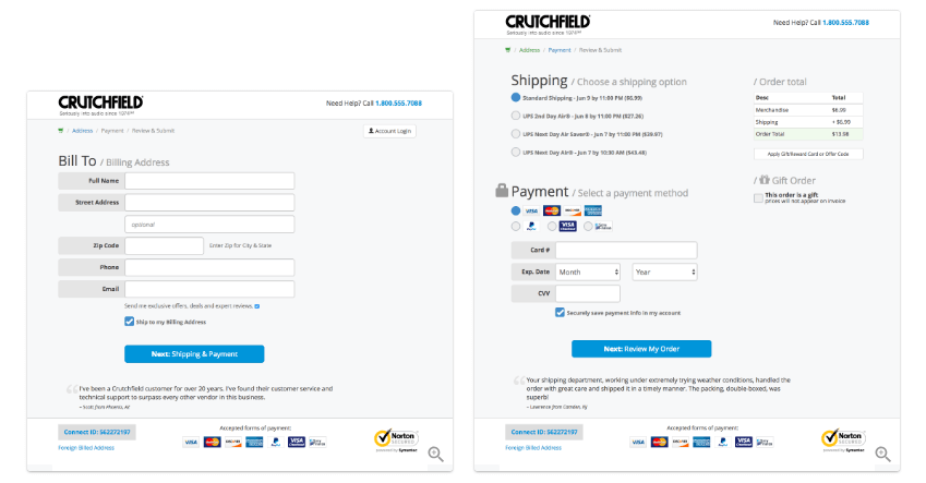
“An entire checkout flow can be as short as 6-8 form fields. Here Crutchfield’s 8-field checkout flow is shown. That’s only 54% of the number of fields in an average checkout, which has 14.88 fields.”
Remember, every unnecessary field adds a little bit of friction and makes the customer more likely to abandon the cart.
That is why you should reduce the number of form fields in your checkout flow as much as possible.
Conclusion
The phrase “quick wins” can be deceptive because we are used to associating the effort we put into something with the results we get from it. And that’s how it usually works.
However, you have to remember that your customers don’t care about how much effort you put into optimizing user experience, what they want is an easy way to pull out their credit card and buy your products.
That is why something that sounds silly, like reducing site loading time by one second, can have a drastic impact on your bottom line.
So never discount the power of quick wins. They can add up to a lot of money over time.
